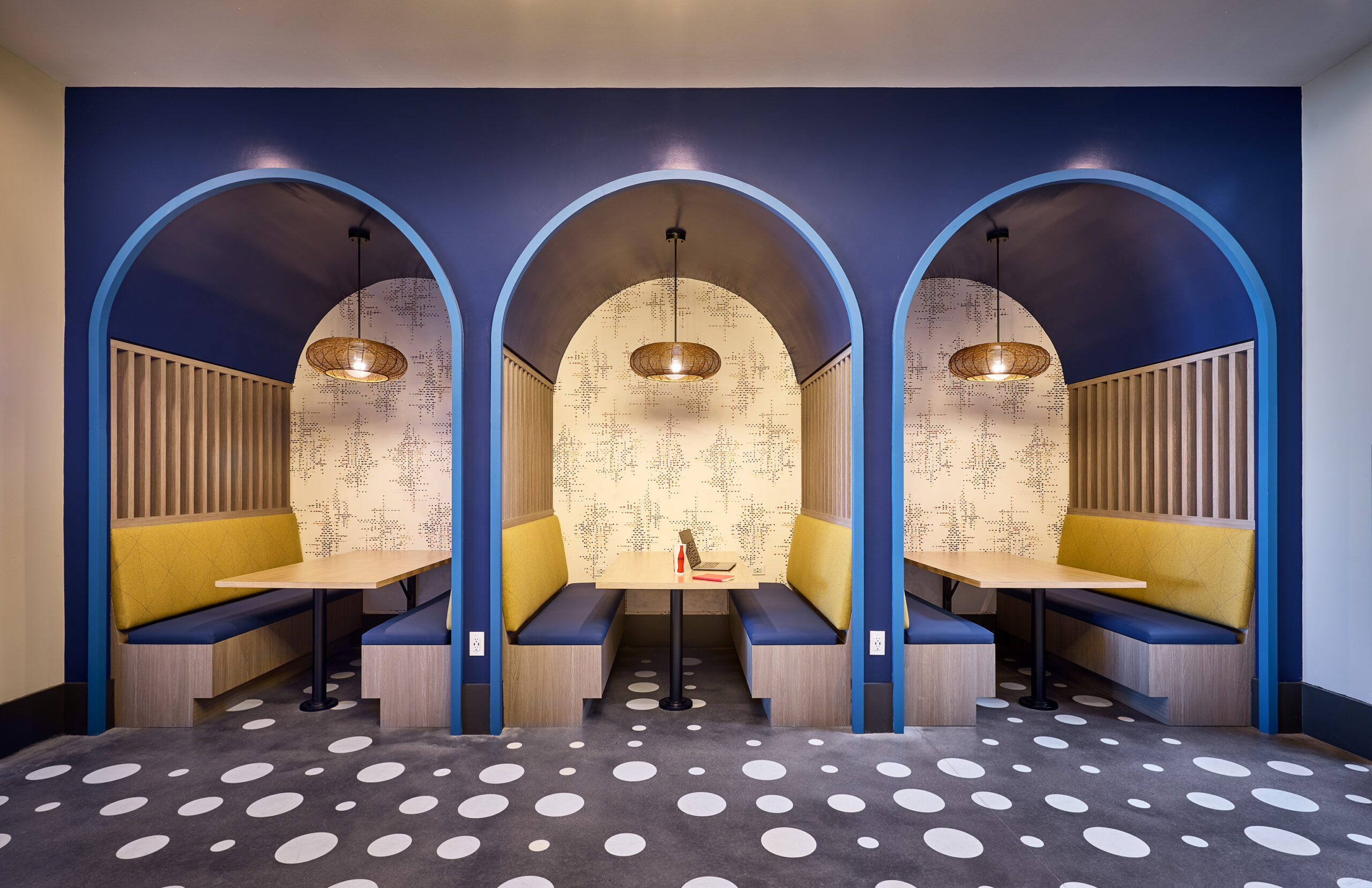
Vibrant colors stimulate lofty academic pursuits and highlight the arched shape of booths in a student residence.
More than the color of money.
No matter what you're designing, you get the biggest 'bang for the buck' with color. Paint and accessories are far less expensive than construction, and oh, what an impact!
Color is a universal language, which makes it a potent contributor to any interior design. For most of us, it's impossible to imagine a world without color. Who doesn't remember the impact of the transition from black and white to color when Dorothy opened the door in 'The Wizard of Oz?'
It draws us in and connects us with our environment and the things we love. With about 80% of human experience filtered through the eyes, visual cues are vital to getting a message across. Color influences us both physiologically and psychologically, tying all of our senses together. It affects our behavior and evokes reactions. Each color conveys its own unique message and meaning on a visceral level. And, while we do have immediate reactions to color, up to 95% of our responses are dictated by our subconscious. Color grabs our attention first, and then connects with people at the deepest level.
'Color is the visual cue that defines our world' – MARY COOK, FOUNDER AND PRESIDENT
The world of color takes shape
The evolution of our use of color has always been closely tied to where it comes from and how it's produced. It's just as true today as it was 17,000 years ago when cavemen used the colors they found nearby to paint the scenes of their lives on the walls of caves. Ochre, red earth and white chalk were used to express themselves. Pigments were later produced at a larger scale in Egypt and China. But when synthetic pigments were introduced in the 19th century, color production really exploded.
Purple, because of its rarity, was once reserved for royalty and the rich and powerful. But, in the late 1880's, when it became the first synthetic dye that could stick to fabric, it triggered a 'purple craze.' Purple was everywhere!
As technology found new ways to make color 'stick,' the expanded use of color made the 'purple craze' look like a flash in the pan.
It's no wonder that color is integral to a brand's identity. Think UPS Brown, Coke Red, and FedEx Purple and Orange. Even the American holiday calendar is color coded. Christmas is red and green, Halloween is orange and black, Hanukkah blue and white, and the 4th of July red, white and blue. Did you know that if they made M&M's in ten colors instead of the standard six, you'd eat more of them? Mars does, too. That's why you can order M&M's in twenty different colors to match any holiday, team or occasion. Breast cancer awareness adopted pink ribbons because focus groups said it was soothing, comforting, and healing.
The 'dictionary' of this universal language is called Pantone. Started in the 1950's, the company hired Lawrence Herbert in 1956. With a degree in biology and chemistry, Herbert simplified and standardized the company's color offering. In 1962, he bought the company and the next year introduced the PANTONE MATCHING SYSTEM which became the standard for global communication of color in the printing publishing, packaging, graphic arts, paint, plastics, coatings, computer, video, film, textile and fashion industries.
This groundbreaking innovation allowed for the faithful selection and reproduction of consistent, accurate color anywhere in the world. The tool organizes color standards through a proprietary numbering system and chip format, which have since become iconic to the Pantone brand. Today, Pantone's color language supports all color conscious industries: textiles, apparel, beauty, interiors, architectural and industrial design encompassing over 15,000 color standards across multiple materials including printing, textiles, plastics, pigments, and coatings.
'Color has become the universal language for communicating with consumers.'
– MARY COOK
Soothing emerald toned lounge chairs contrast the bold backdrop in this main entry lobby to elevate the impact at arrival.
Marketing color doesn't come out of the blue
'The Color of the Year' is like a holiday that Hallmark created to sell cards.
The color universe is always expanding, and so is the business of color. There are color apps, color consultants, color palettes hand-picked for artist and designer inspiration; there are color forecasters who are constantly looking for clues as to what consumers find appealing. There are even color naming experts who work with major paint companies to develop creative names for colors like 'Wall Street,' 'Balanced Beige,' and 'Agreeable Gray' to lure designers and consumers. It's no surprise that 'Wall Street' was most popular with male consumers in the early 2000's. And then there is the annual 'Color of the Year.' Or, more accurately, 'Colors of the Year.' Pantone always has one, and so do all the major paint companies like Sherwin Williams, Benjamin Moore and Behr.
Every year when they're announced, the press starts calling interior design firms for reactions. And every year, they're disappointed to learn that we're not in the paint business. For most interior designers, other than being somewhat interesting, they really don't drive what we do. We certainly track color trends. But we also rely on influences behind the power of color to elevate mood and well-being in any room or setting.
'Color can make a space feel larger, or smaller and more intimate. It can inspire certain types of activities, add sophistication, energize a gathering area, and create memory. It can work with other design fundamentals to strengthen or soften them.'
-JOSH KASSING | VP DESIGN DEVELOPMENT
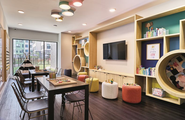
A mix of high contrast, bright colors inspire play and imagination in this children’s room.
The Why Behind Color
Understanding the genesis of color trends provides insights into consumer preferences that have implications for designers. Over the years many organizations researched color trends in an attempt to tie them to economic conditions. SeeMeDesign, a branding company, researched how color trends begin and evolve.5 They discovered nearly all color trends connect back to one of three origination factors:
1. Optimism and hope
2. Peer influence and personal choice
3. Technological advancements
Many color powers-that-be agree that optimism and hope are primary determining factors in color trends. Troubling times inspire bright color choices, which serve as an antidote to consumer hardship. SeeMeDesign's research report, 'Color and the Economy: A Study of Color Behavior and Economic Performance,' notes that according to Kit Yarrow, a consumer psychologist at San Francisco's Golden State University, colors represent the mindset of the consumer. Conversely, Jackie Jordan, Director of Color Marketing at Sherwin Williams, thinks we shouldn't place too much weight on consumer disposition in reflecting color trends. While some consumers respond to tough times by cocooning, and choosing the long-lasting practical colors, others defy them by choosing bright, lively colors that lift their spirits.
There's no doubt that different colors have different effects on us. They can affect our feelings, memory, attention, and motivation to work. According to the College of St. Scholastica, color has an impact on student behavior, academic performance, and feelings of well-being.6 In addition to their overall influence, each color has specific traits that impact individuals in different ways:
1. Red, The Energizer stimulates the adrenaline glands and can generate feelings of energy and encourage creativity.
2. Yellow, The Attention Grabber, generates positive energy, encourages creativity, and is the ultimate tool in capturing the attention of a restless classroom.
3. Orange, The Mood Lifter, encourages critical thinking and memory. It also has an especially high effect on circulation and the nervous system, increasing oxygen supply to the brain, stimulating mental activity and inhibitions.
4. Green The Calming Concentration Catcher, green promotes calmness and a sense of relaxation. It's also great for encouraging long-term concentration. It's the most restful color for the eye and creates a feeling of ease.
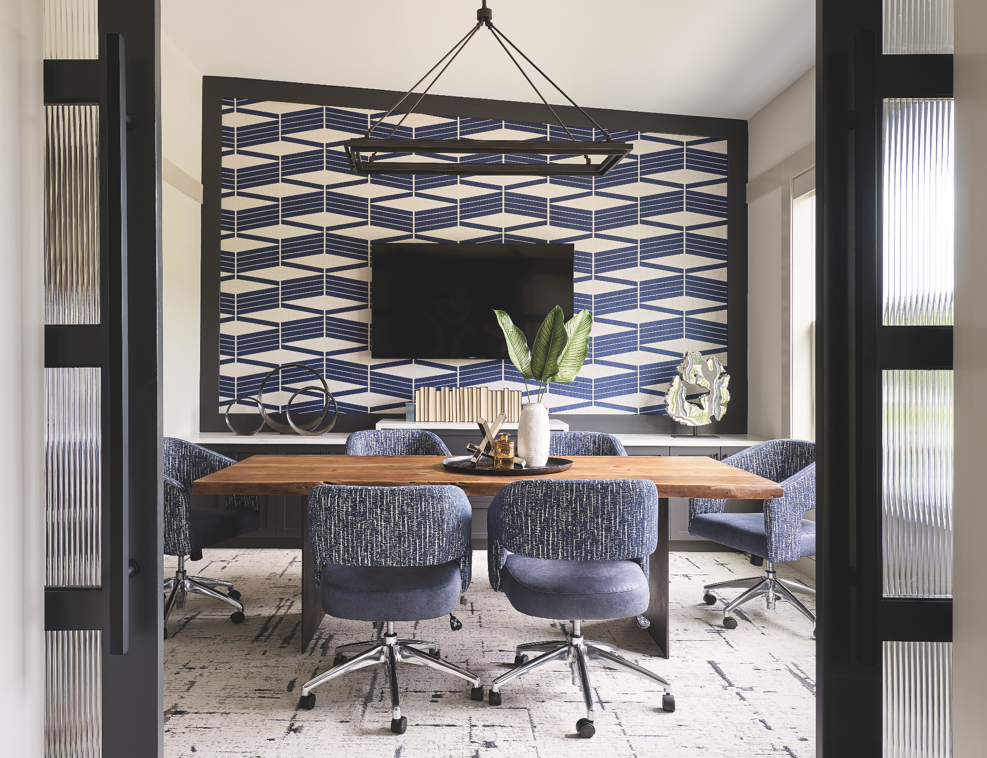
5. Blue The Productivity Driver, has proven to have a calming effect on the heart rate and respiratory system. It encourages a sense of well-being, making it ideal for learning and work situations that are intensely challenging and cognitively taxing. People with highly intellectual work that requires a high cognitive load are most productive in blue environments.
We also know that color can make a space feel larger, or smaller and more intimate. It can inspire certain types of activities, add sophistication, energize a gathering area, and create memory. It can work with other design fundamentals to strengthen or soften them, depending on what you are trying to do. Lets look at the three origination factors.
OPTIMISM AND HOPE
We can't help it. Our brain has a built-in bias toward optimism – defined as a hopefulness and confidence about the future or having a successful outcome. Tali Sharot explains it in detail in her book, The Optimism Bias: A Tour of the Irrationally Positive Brain.7 As interior architects and designers, we use our deep understanding of who we're designing for to curate specific colors that will tap into this optimism, knowing they create a sense of well-being with an aspirational impact. The right colors elevate the present experience and instill confidence about the future, inspiring people to want to live there, join there, or just linger there longer.
PEER INFLUENCE AND PERSONAL CHOICE
As consumers, we like to think we aren't susceptible to outside influences in our decision-making processes, but those influences are nearly impossible to escape. SeeMeDesign's report cites a study conducted by McKinsey that found peer influences and recommendations are the primary factors in 20 to 50% of buying decisions. While most of us think we are in charge of the way our thoughts develop, we're a lot more to that story.
Risk adverse companies narrowed the color palettes on the assembly line and risk-averse consumers did the rest. Driven by the promise of resale, Americans are chromatically sheepish when it comes to big ticket purchases, painting their homes gray (or other neutral colors) and driving gray cars. According to a 2020 survey, more than 72% of cars on the road are either black, white, or gray.8 And since we live under a system called 'Capitalism,' sales figures matter. 'A good color sells, a bad color builds inventory, and nobody wants to build inventory,' says Leslie Harrington, executive director at the 100-year-old Color Association of the United States. 'If automakers see that black and gray and white always sells really well, they're going to keep making black, white, and gray.' Now, car companies are even making new, nuanced shades of gray.
Big name retailers like Pottery Barn, Restoration Hardware, and Ralph Lauren help reduce the risk for consumers by marketing 'expert recommended' combinations and palettes that have been customized to pair perfectly with their home furnishing lines.
According to 'How gray became the king of color,' a Fast Company article, the tide may be turning. We're moving away from 100 years of industrialization and mass production and seeking personalization. You can buy a custom-painted Porsche, or add a pop of color to your own pair of Nikes. You can even tell an AI to create a highly customized color based on an oral description of a New York City summer sunset. 'It'll become common that your color is your color, and you'll want it in your iPhone, on your shoe, in your car, or wherever you want it,' says Anat Lechner founder of HueData, a color research and color data platform for making more informed data based color decisions.
TECHNOLOGICAL ADVANCES
Technology has become a game-changer on all fronts of consumer goods. Most of the synthetic materials found in today's textiles did not exist until late into the 20th century. But it's easy to forget about the significant advancements in performance fabrics, color, and synthetics technology. Waterproof, stain-resistant, and heat-retaining fabrics were an impossibility until modern times, just like neon and metallic dyes, inks, paints, and manufactured materials were only a figment of the imagination until recently.
Marilyn DeLong and Barbara Martison, authors of Color and Design note that colors can be used to trace influences of new technologies and processes.9 In the 80's when kids roamed more freely, neon clothing emerged from the need to make children more visible while biking and running around. These items grew to not only be functional, but they became a dominate trend. Neons, metallics, and hyper-color technology were not even fathomable just 50 years ago. And today performance fabrics made suitable for indoor and out have advanced their color technologies. They've advanced to such a high level, that outdoor living, dining, and entertaining have remained the #1 home improvement project for the last decade as consumers elevate their yards and patios to higher and higher levels.
And the changes are never ending. Email and smartphones keep us constantly connected, and consumers have come to expect the ability to buy exactly what they want when they want. With each new tech product, we are often presented customization options such as favorite color, pattern, or photo. As economic and technologic growth continue over the years, these options can only be expected to grow. In short, if we had to choose a top color influencer for the future, it would be technology.

The soft purple tones in this girl’s bedroom combine with carefully curated accents to evoke a wistful femininity.
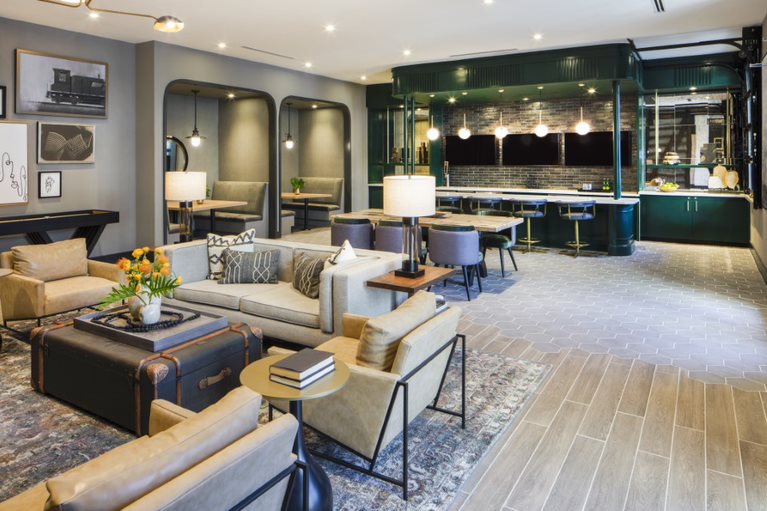
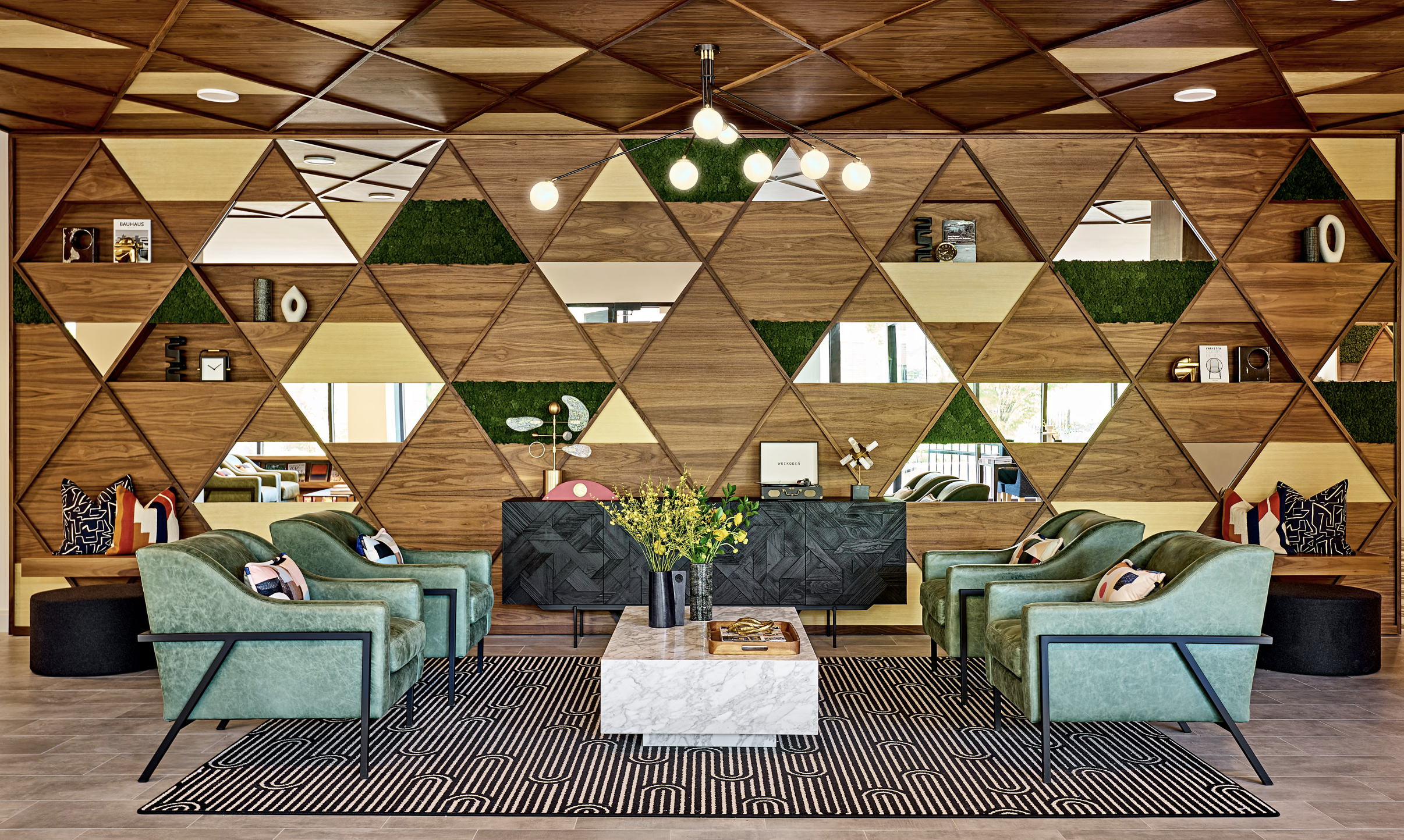
Deep greens bring an air of sophistication to this relaxed social lounge.
The spectrum of success
Color is one of the most powerful design elements. No matter the size of the project, the budget, or the client, color will always play a key role. Once a project is in the hands of an interior designer, we focus on the aspirational mindset of our target demographic, and their related psychographic, and geographic influences. We're certain that color directly influences behavior and can make or break the appeal of a space. By combining demographics and psychographics with color science we create spaces that perform the way we want them to.
A good example is a model home interior we were called in to redesign. The builder hadn't sold one in three months. The entire first floor had been painted a butter yellow – a real 'attention grabber.' But, it needed to do more than just grab attention. The target demographic was an affluent, move-down empty nester. When customers caught a glimpse of themselves in the mirror of this all-yellow home, they didn't look good, so they didn't feel good about themselves, or the home. We changed the general wall color to a soft warm neutral that enhanced skin tones in the mirror. The home began to sell immediately.
'By combing demographics and psychographics with color science we can create spaces that perform the way want them to.'
-MARY COOK
So much of the conversation about color today comes from home furnishing brands, paint companies, Pantone, and HGTV celebrities promoting a color or product in the name of increasing sales. We're all for increasing sales. But what if we used real data to inform our color choices? We could make a lot of money, and increase wellness and well-being, effect moods, improve performance, and elevate the human experience.
And that would be a horse of different color.
GET THE PDF VERSION HERE
MEET THE AUTHORS

Mary Cook, Founder and President
Mary Cook is the founder and president of Mary Cook Associates (MCA), a fully integrated interior architecture and design firm nationally known for creating innovative interiors that are targeted to market demands, designed to increase property value and deliver measurable returns. The firm's projects for premier owners and developers of real estate include multi-family, model homes, student living, senior living, clubhouses, restaurants, and hospitality environments. Under Mary's leadership, the work MCA produces emphasizes functionality, showcases possibilities, and accelerates sales and leasing. Currently celebrating its 35th anniversary, the firm continues its national presence with award-winning work that spans 36 states.

Josh Kassing, Vice President, Design Development
Josh Kassing is Vice President, Design Development at Mary Cook Associates (MCA). Serving as the leader of MCA's Concept Studio, he bridges business development, marketing, and design to develop and curate the firm's unique design approach. With nearly a decade of design experience for domestic and international commercial, residential and hospitality projects, he is a regular go-to source for the industry. His contemporary perspectives have been featured in podcasts, Mansion Global, The Wall Street Journal, Builder & Developer, Multi-family Executive, Multi-Housing News, Globe Street and IIDA Perspectives. He is also a frequent presenter at industry conferences.
Watch for our next white paper
on the great enhancers – pattern and texture.
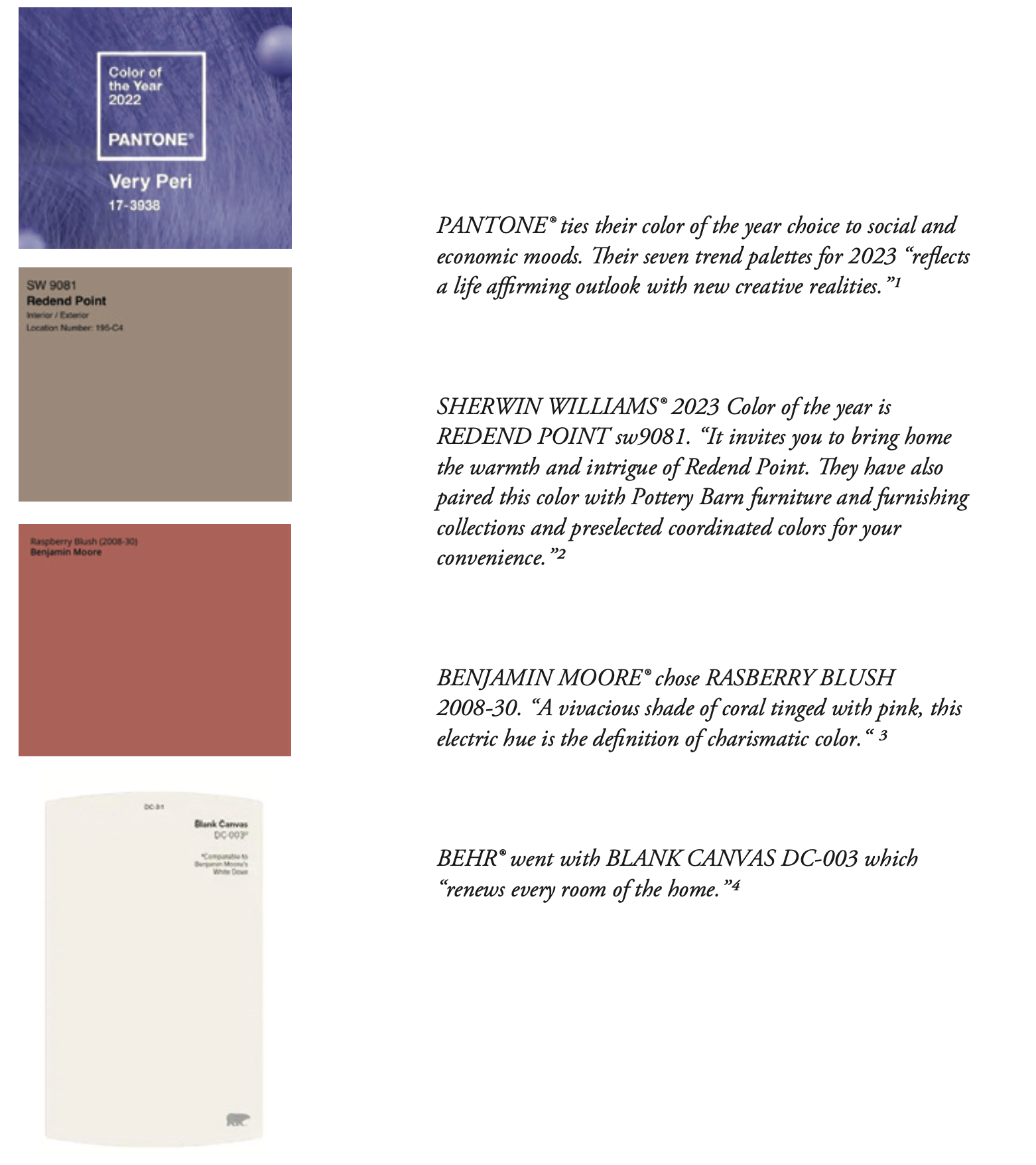
1 'PANTONE View Home + Interiors 2023 With Cotton Swatch Standards,'
2. 'Sherwin Williams® Color of the Year 2023,' https://www.sherwin-williams.com/en-us/color-of-the-year-2023?gclid=EAIaIQobChMI0Lij2IGf-wIVjuDICh1KVQAUEAAYASAAEgKoqfD_BwE
3. 'Raspberry Blush 2008-30 Takes Center Stage as the Benjamin Moore Color of the Year 2023,' Business Wire, October 12, 2022, https://www.businesswire.com/news/home/20221012005245/en/Raspberry-Blush-2008-30-Takes-Center-Stage-as-the-Benjamin-Moore-Color-of-the-Year-2023
4. 'Behr 2023 Color of the Year,' https://www.behr.com/consumer/inspiration/2023-coty/?gclid=EAIaIQobChMIidKG94Of-wIVh4TICh0t2Qq8EAAYASAAEgJgU_D_BwE&gclsrc=aw.ds
5. 'Color and the Economy: A Study of Color Behavior and Economic Performance,' Hannah Boresow, Ellen Witt Monen, W.L. Bishop and Greeley Dawson, SeeMeDesign, January 11, 2016, https://www.seemedesign.com/color-and-the-economy-a-study-of-color-behavior-and-economic-performance/
6. '5 Colors in the Classroom That Will Boost Active Learning,' MooreCo, Inc., December 27, 2019, https://blog.moorecoinc.com/5-colors-in-the-classroom-that-will-boost-active-learning
7. 'The Optimism Bias: A Tour of the Irrationally Positive Brain,' Tali Sharot, Vintage, 2012
8. 'How Gray Became the King of Color,' Elissaveta M. Branddon, Fast Company, August 14, 2022, https://www.fastcompany.com/90778314/how-gray-became-the-king-of-color
9. 'Color and Design,' Marilyn DeLong, Barbara Martinson, Berg Publishers, 2013