When The Chicago Tribune announced the departure from its iconic Michigan Avenue address, co-developers CIM Group and Golub & Company planned a multi-year transformation of the 1925 neo-Gothic skyscraper into Tribune Towers – 34 stories of luxury condominiums. MCA was engaged to design five 1-3 bedroom model units that would complement the prestigious history, appeal to a downtown Chicago market and satisfy the vision for a premier residential living destination.
About This Project
The Challenge:
The impressive architectural style of the building boasts both a 13-century and Art Deco influence. Its historic significance and emergence as a new luxury option in Chicago’s chic downtown scene presented an opportunity to play to the building’s inherent architectural distinction along with freshening interiors with modern designs.
While the target market consisted of high-income, urban residents, the individual units needed to be designed to attract specific audiences each with unique psychographic attributes. The units’ design would need to pinpoint preferences based on age, lifestyle, space utilization, amenities and other needs and interests to facilitate customization according to generational preferences.
The MCA Solution:
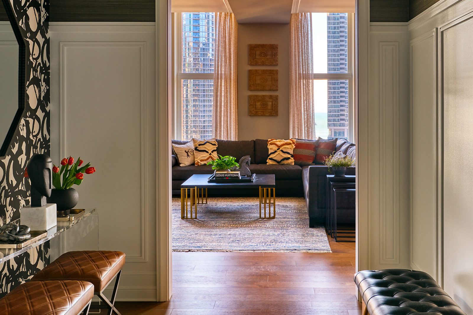
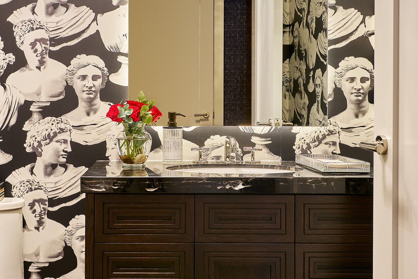
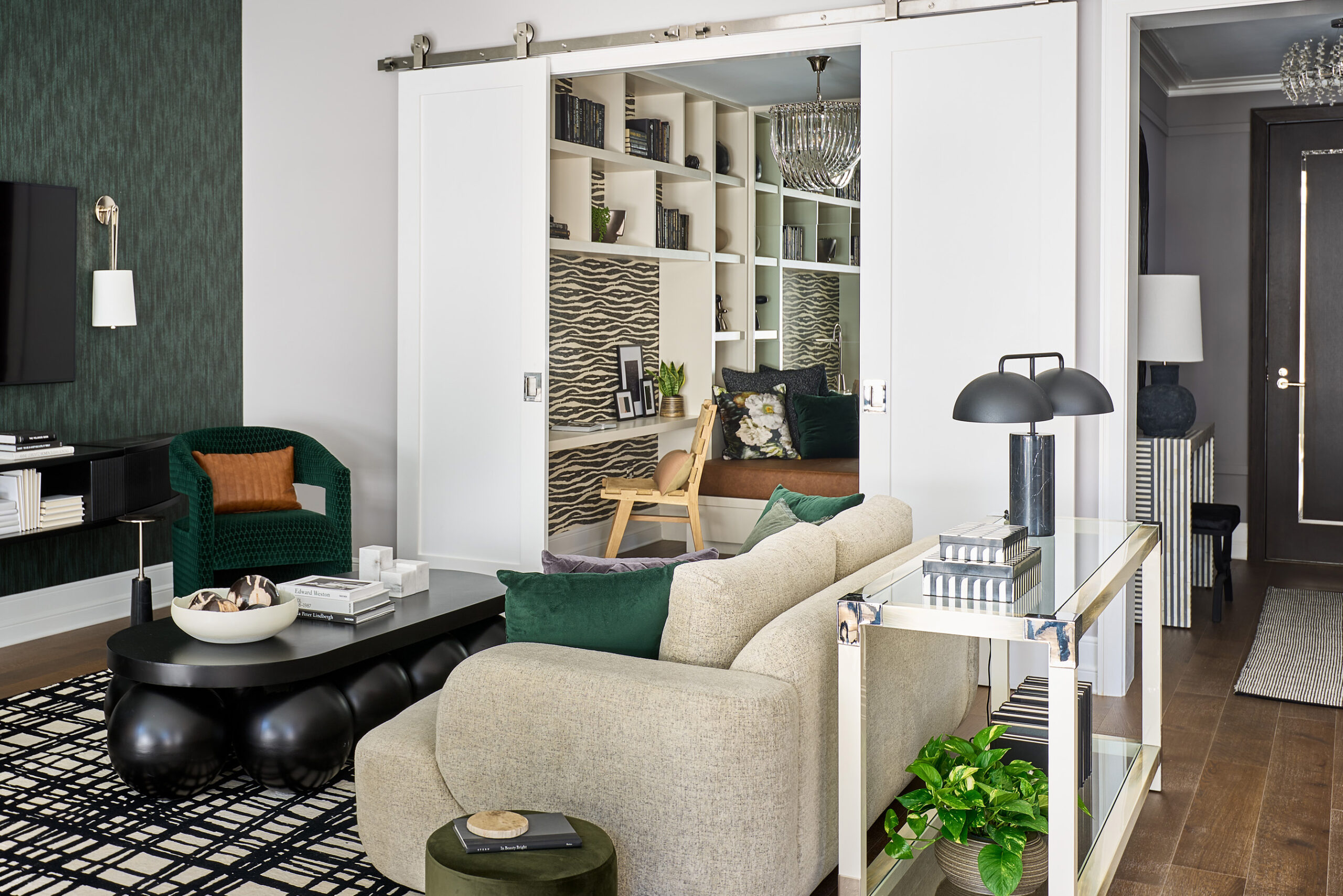
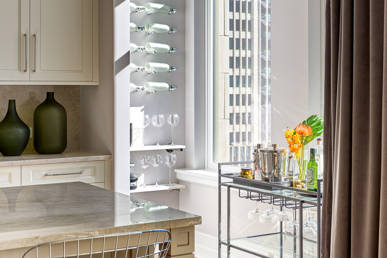
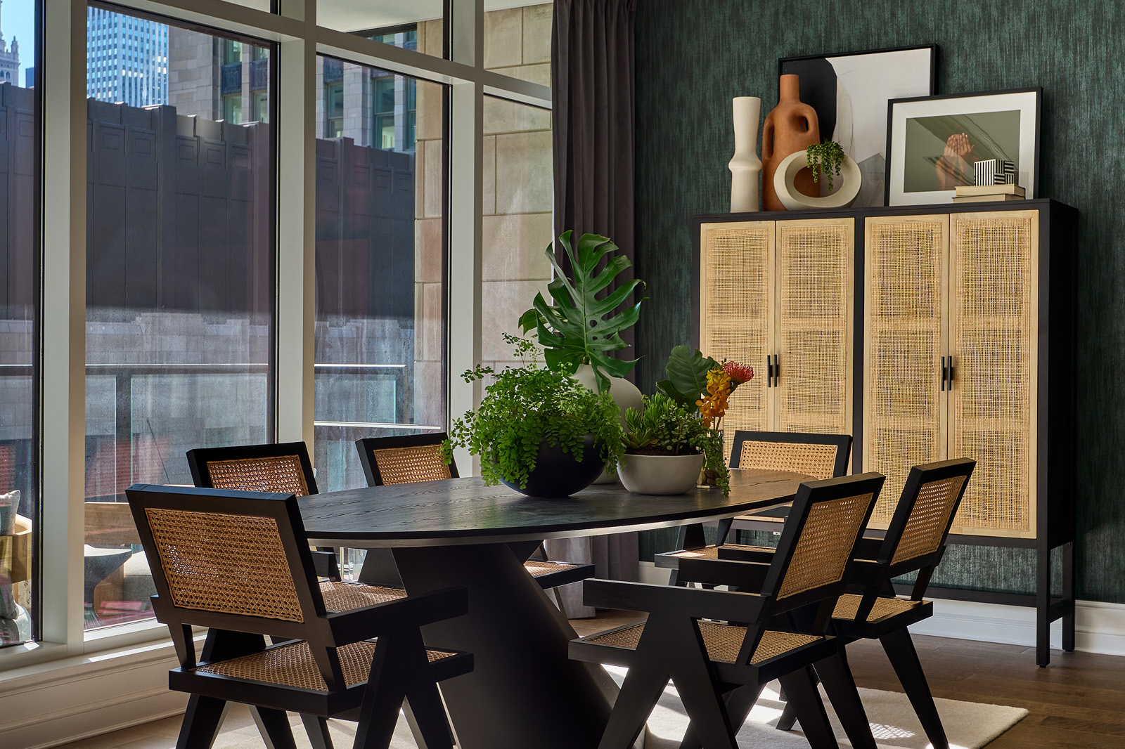
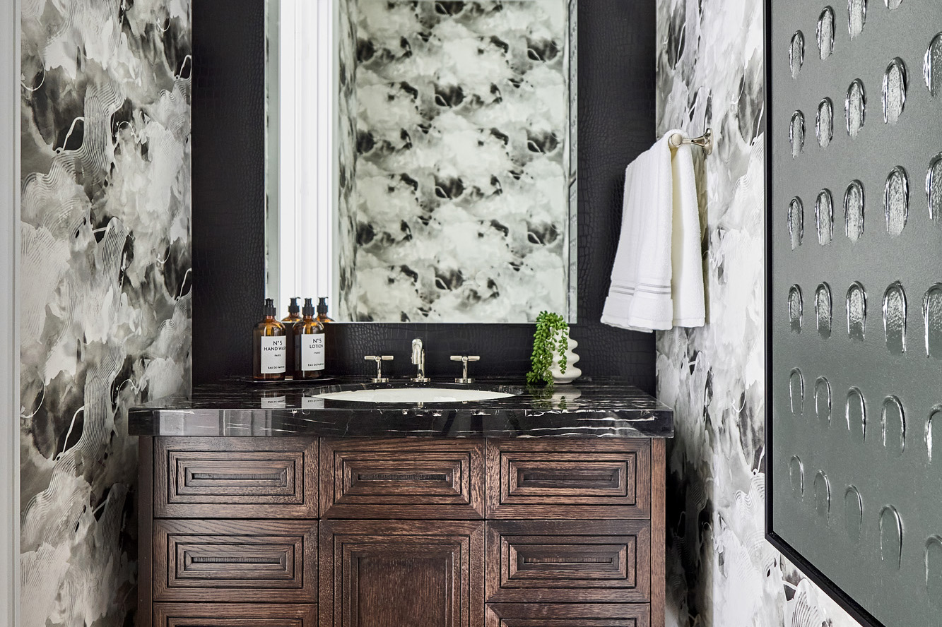
The MCA team incorporated rich textures, materials, colors and multi-functionality into each of the units’ designs. The one-bedroom with library and balcony was designed for a single, professional female with a modern eclectic style. A black and white graphic patterned wallcovering creates a dramatic backdrop for the home office library which can be easily closed off with movable contemporary barn style doors. A rich hunter green wallcovering and bold black and white patterned rug blend the living room with the office and dining area which features black accents. Natural caning on the chairs and an armoire infuses an inviting, warm texture into the space.
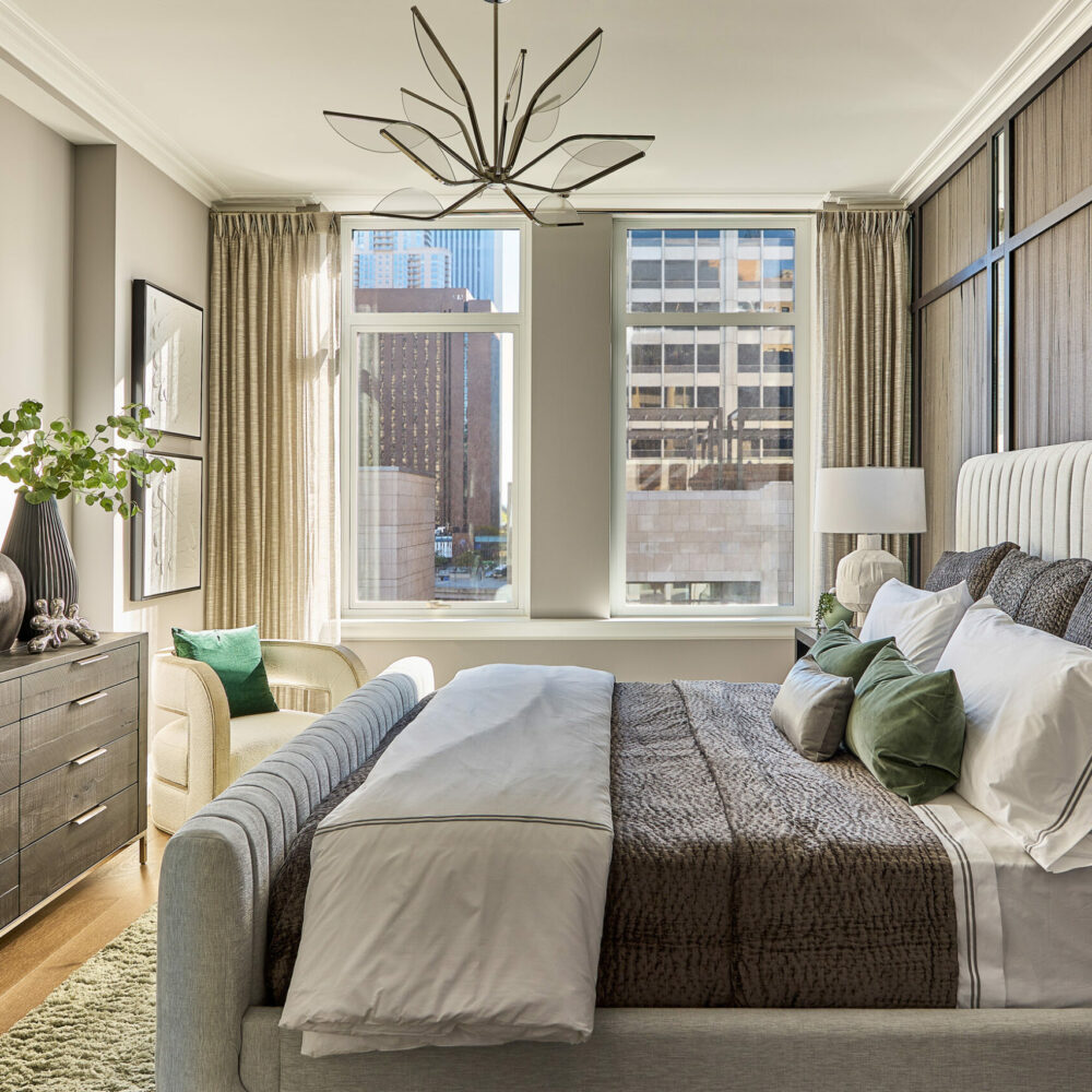
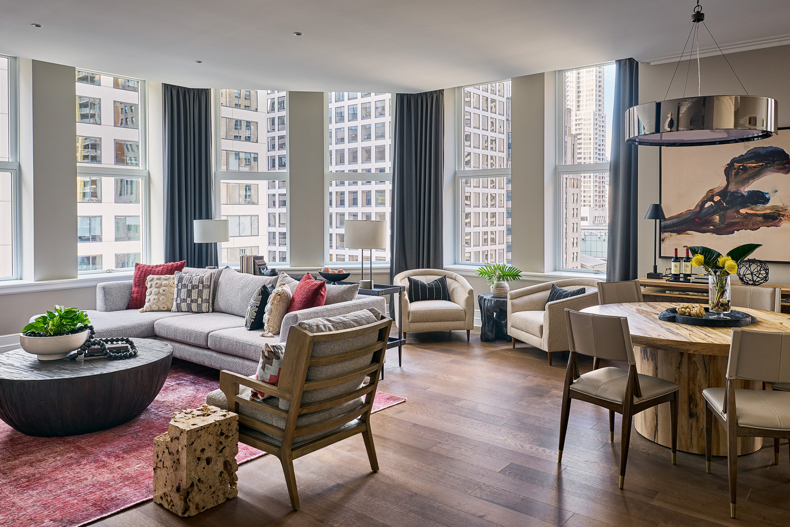
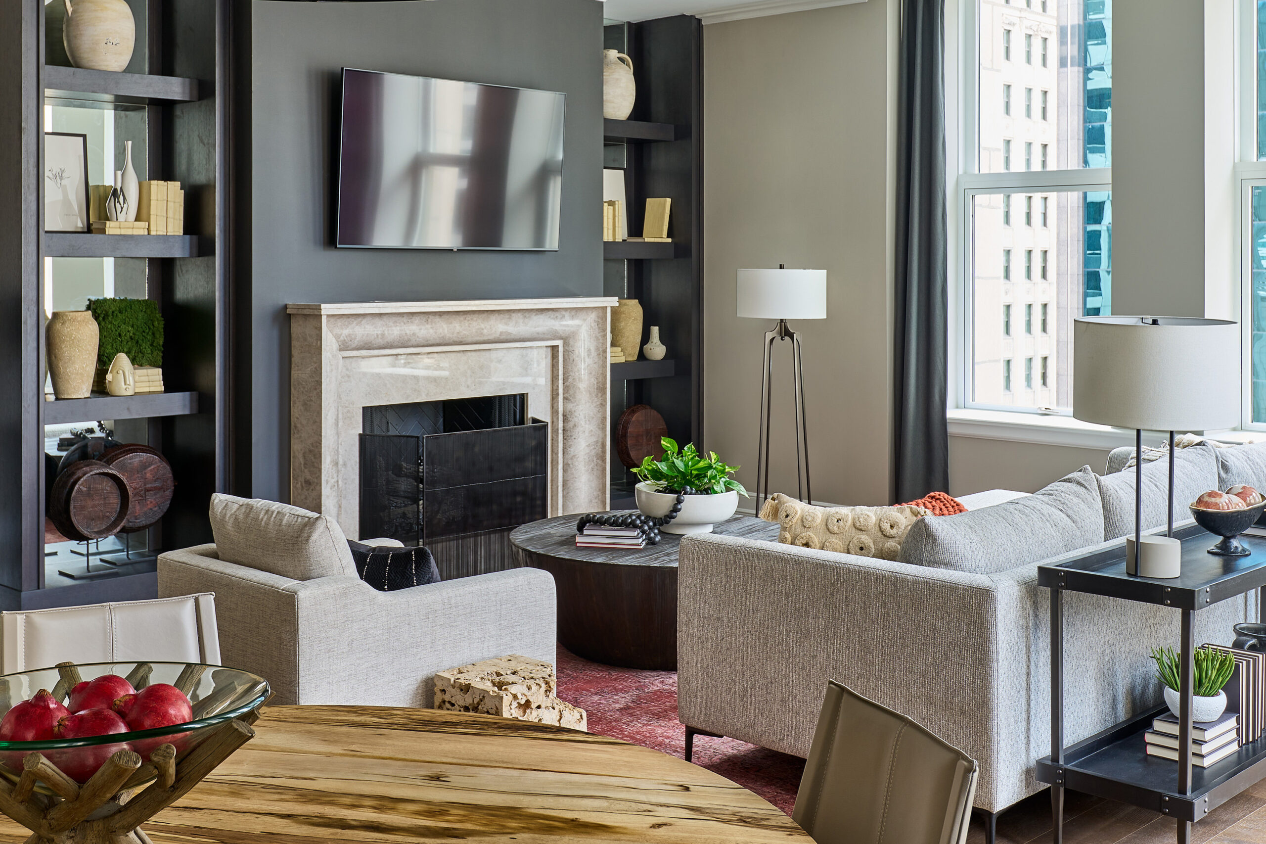
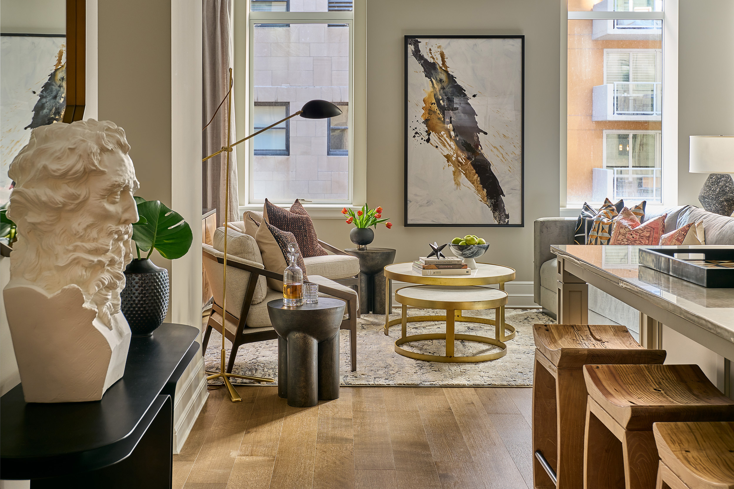
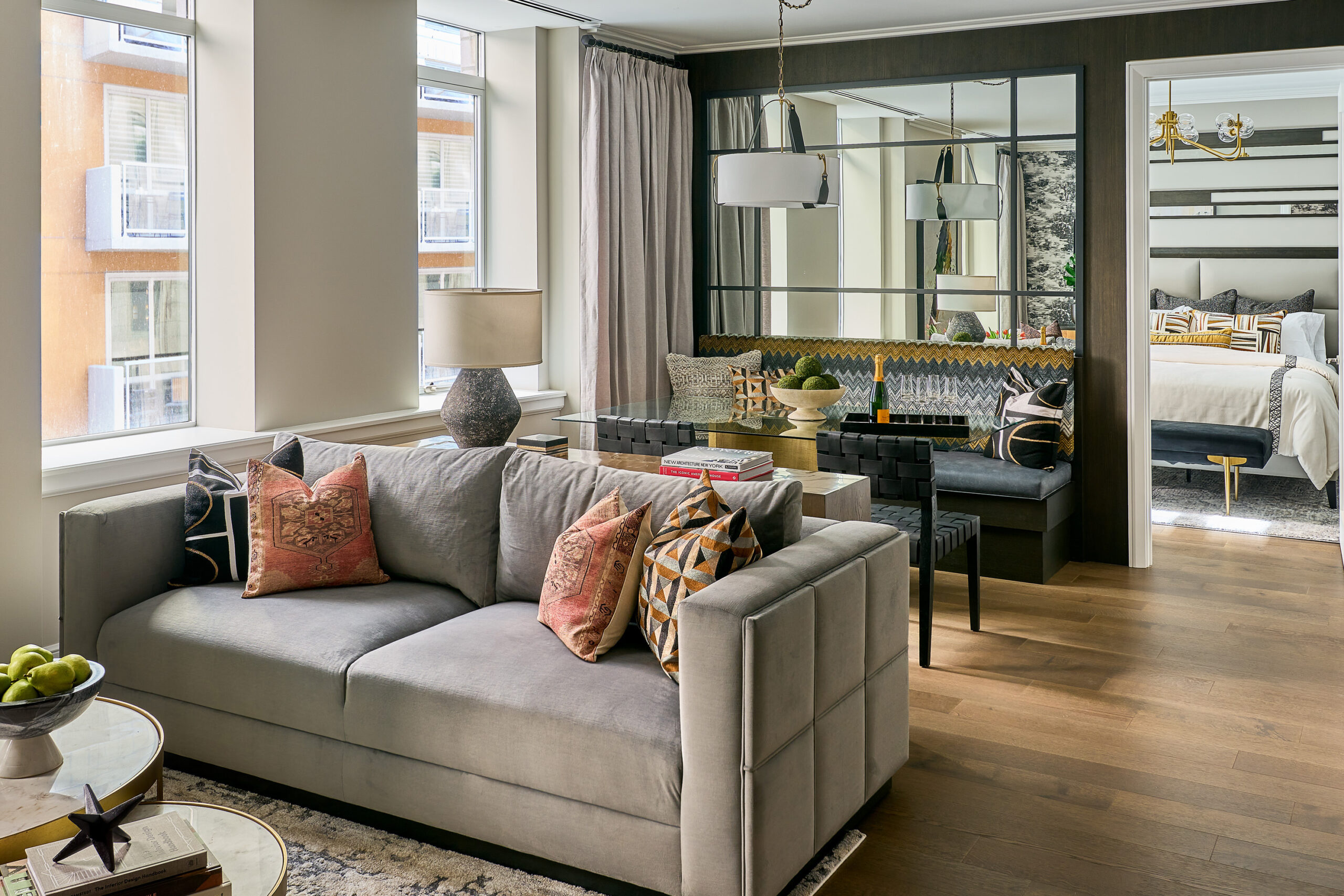
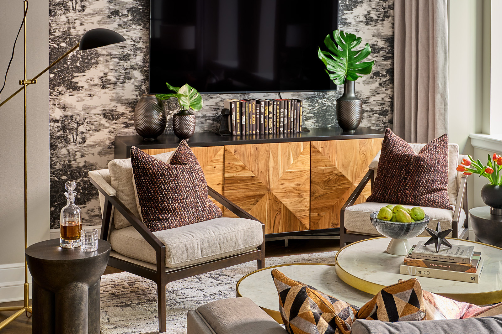
MCA designed one of the two-bedroom units an urban professional gay couple incorporating an aesthetic with an urban masculine vibe punctuated with carefully curated artisanal accents. Cool neutrals and rich navy tones combine with earthy textures and clean lines to create a one-of-a-kind sophisticated design.
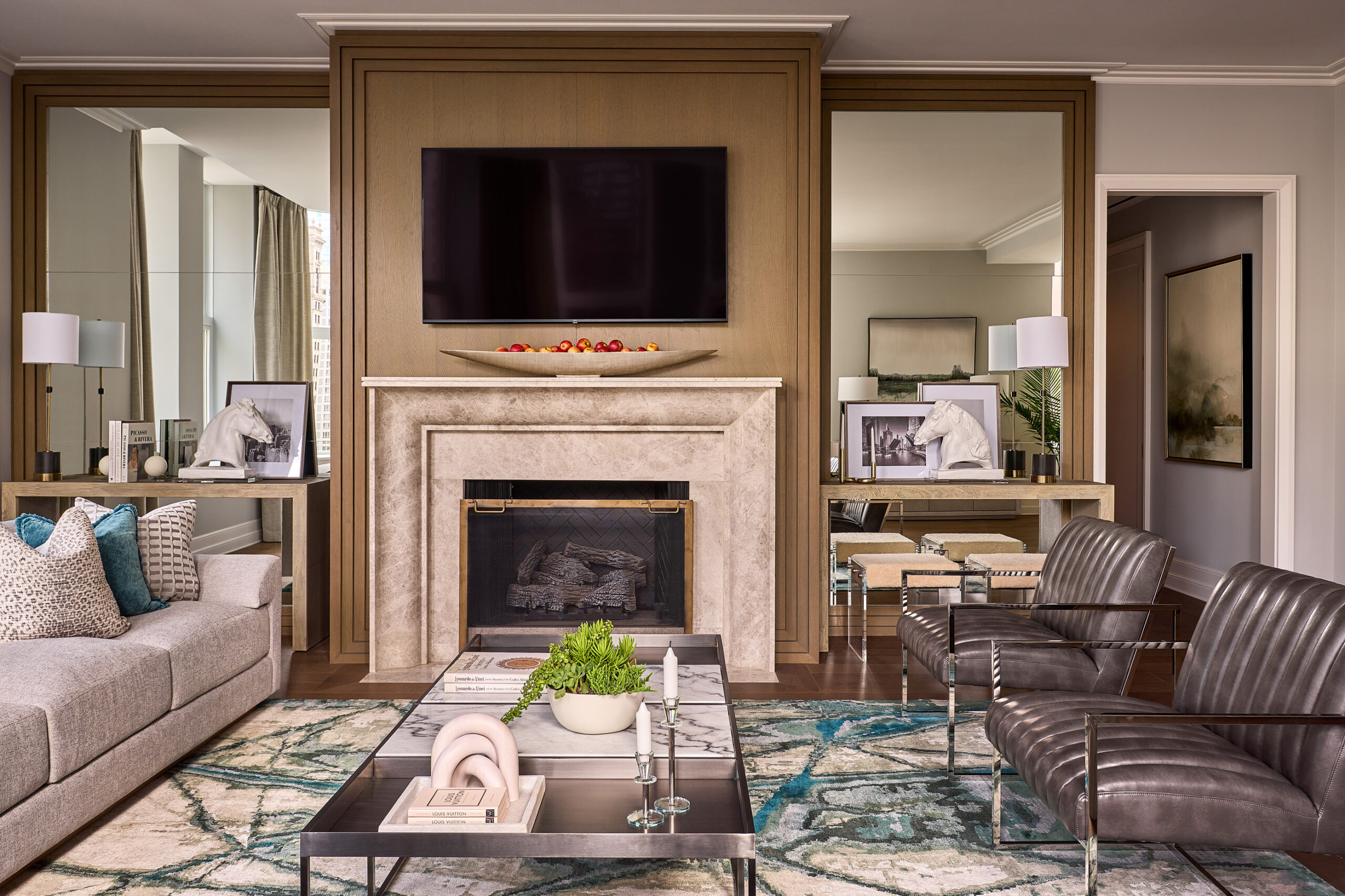
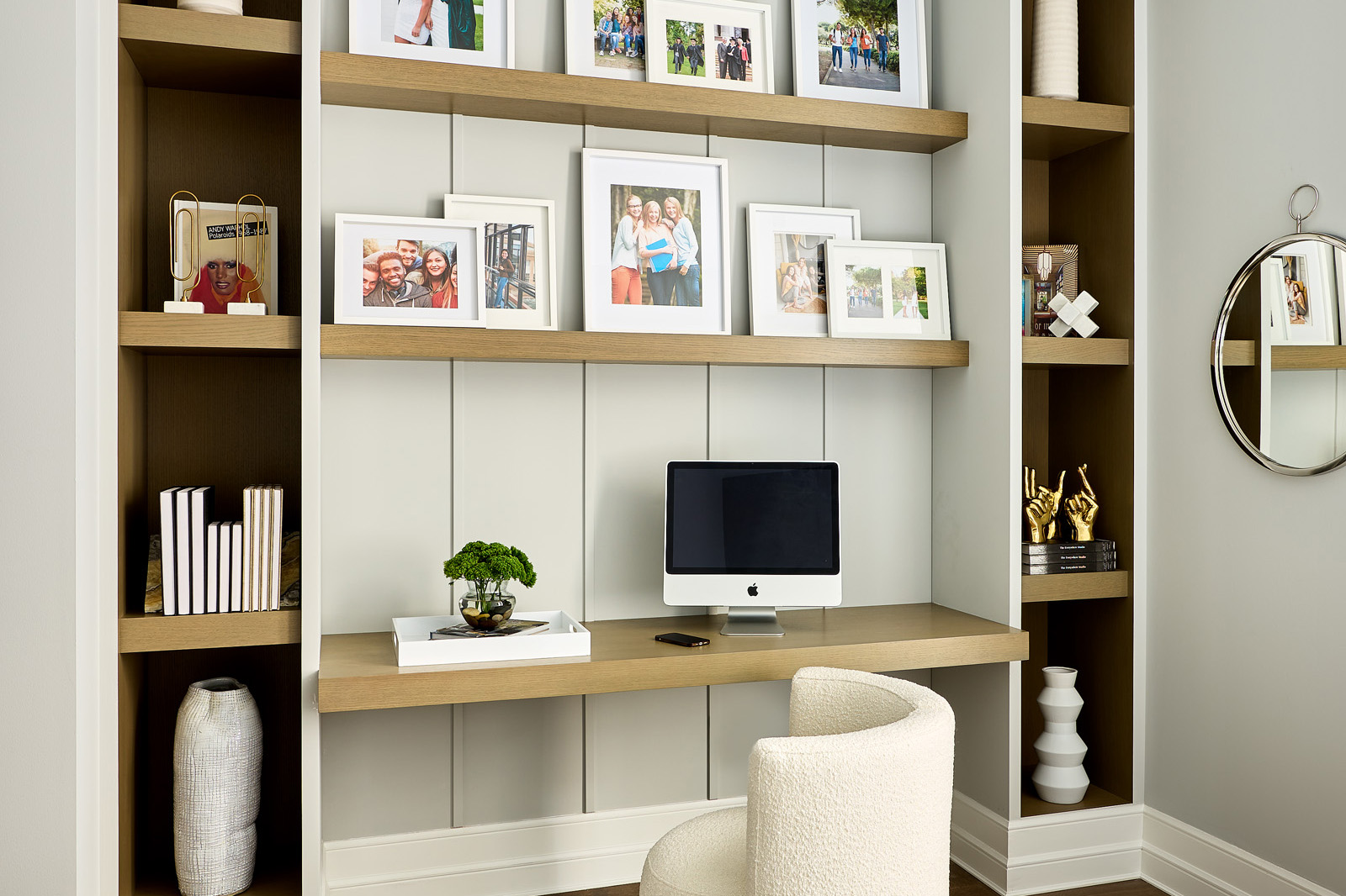
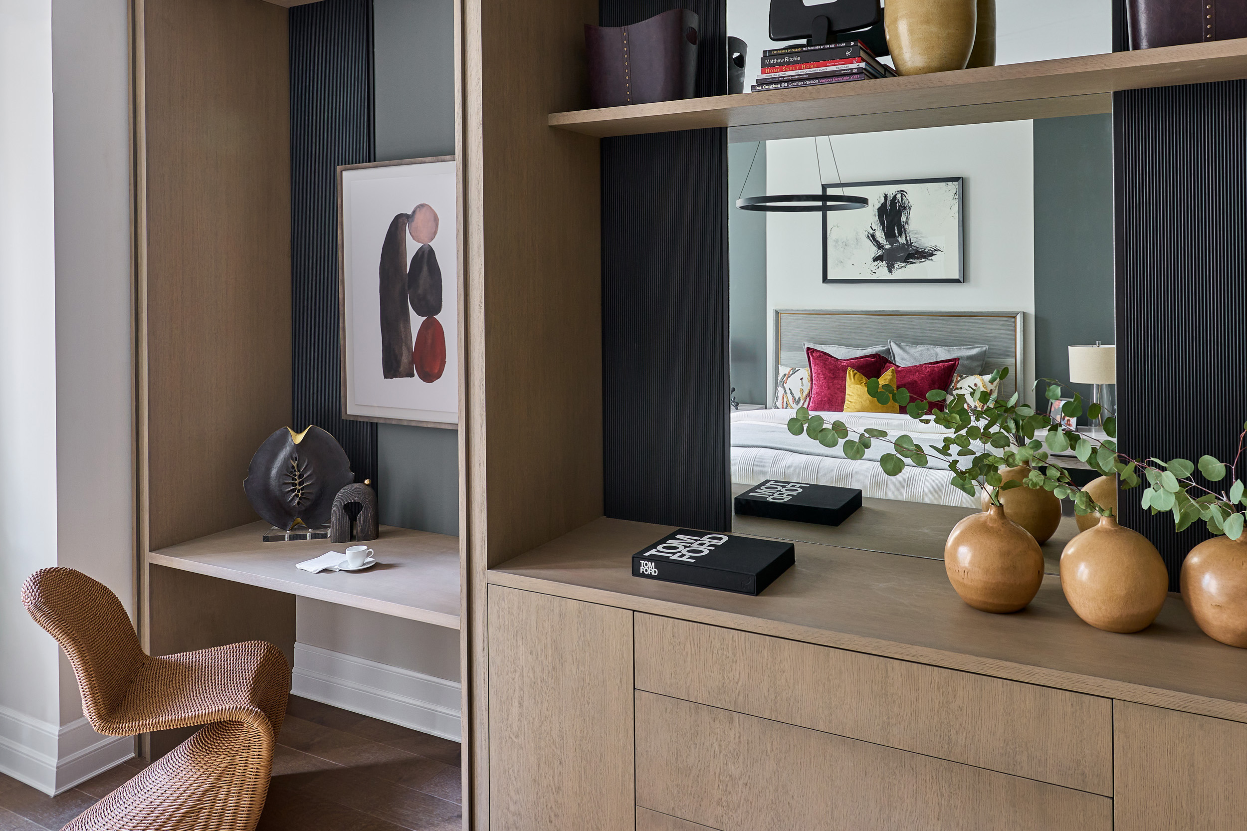
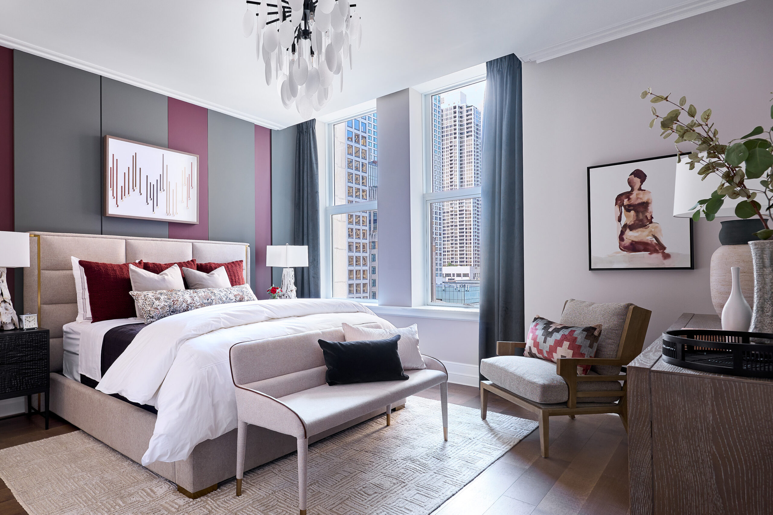
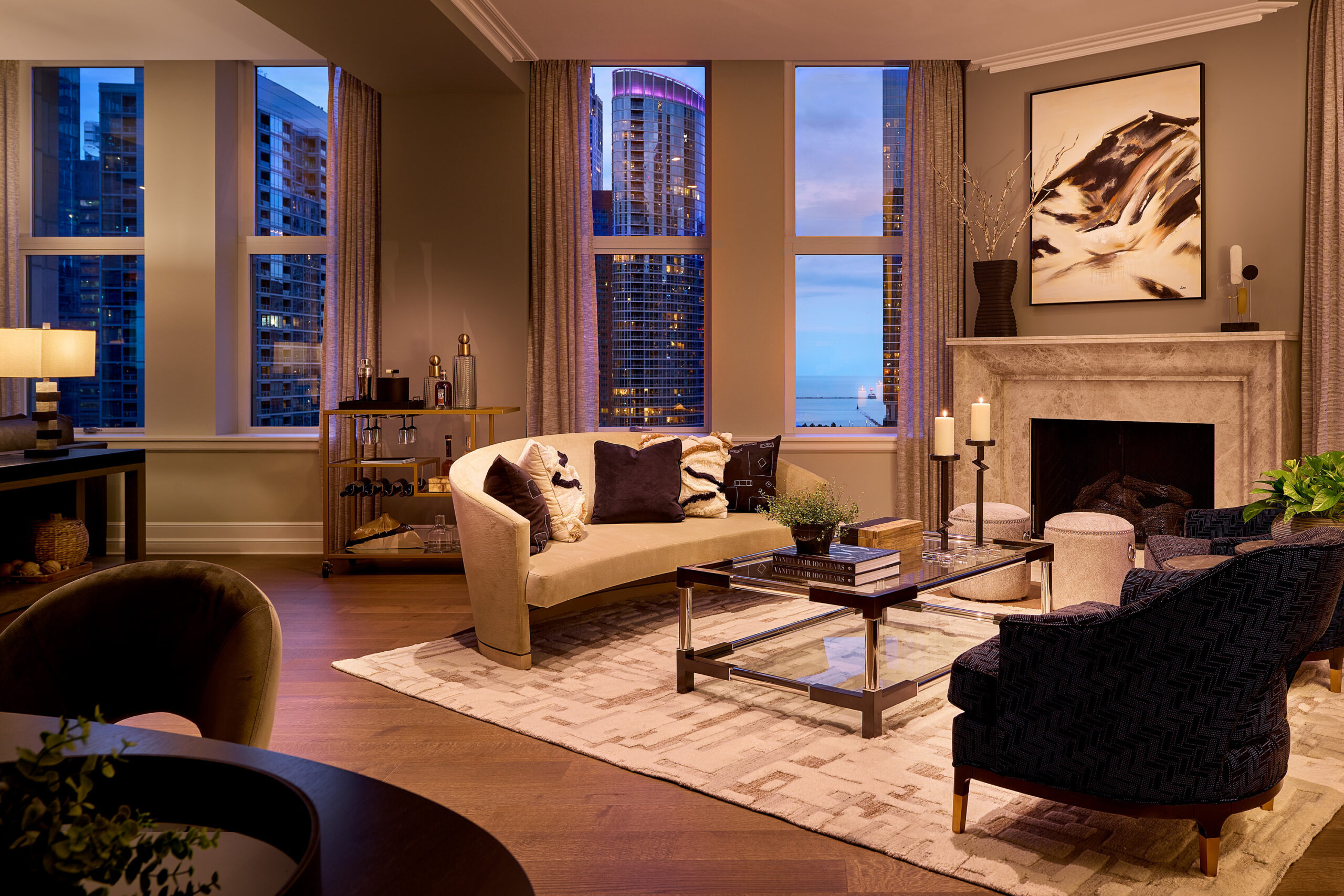
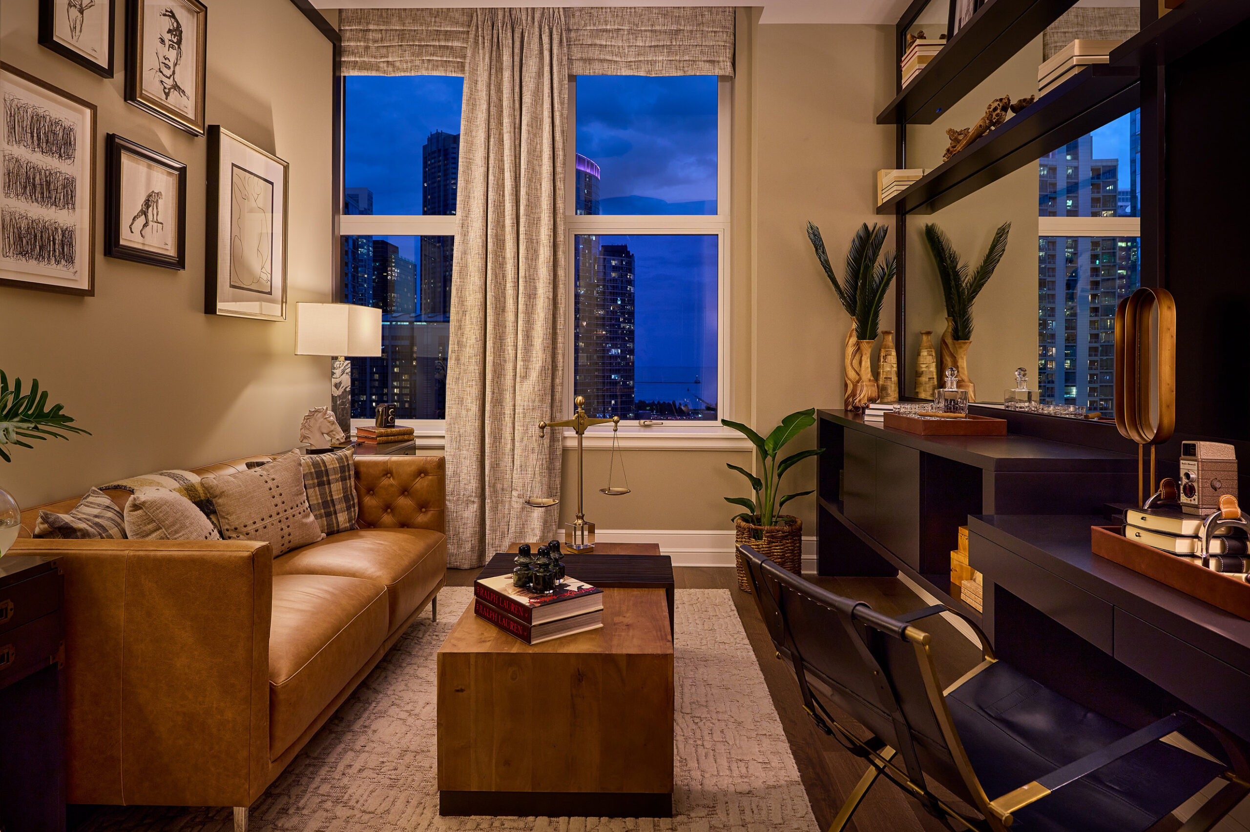
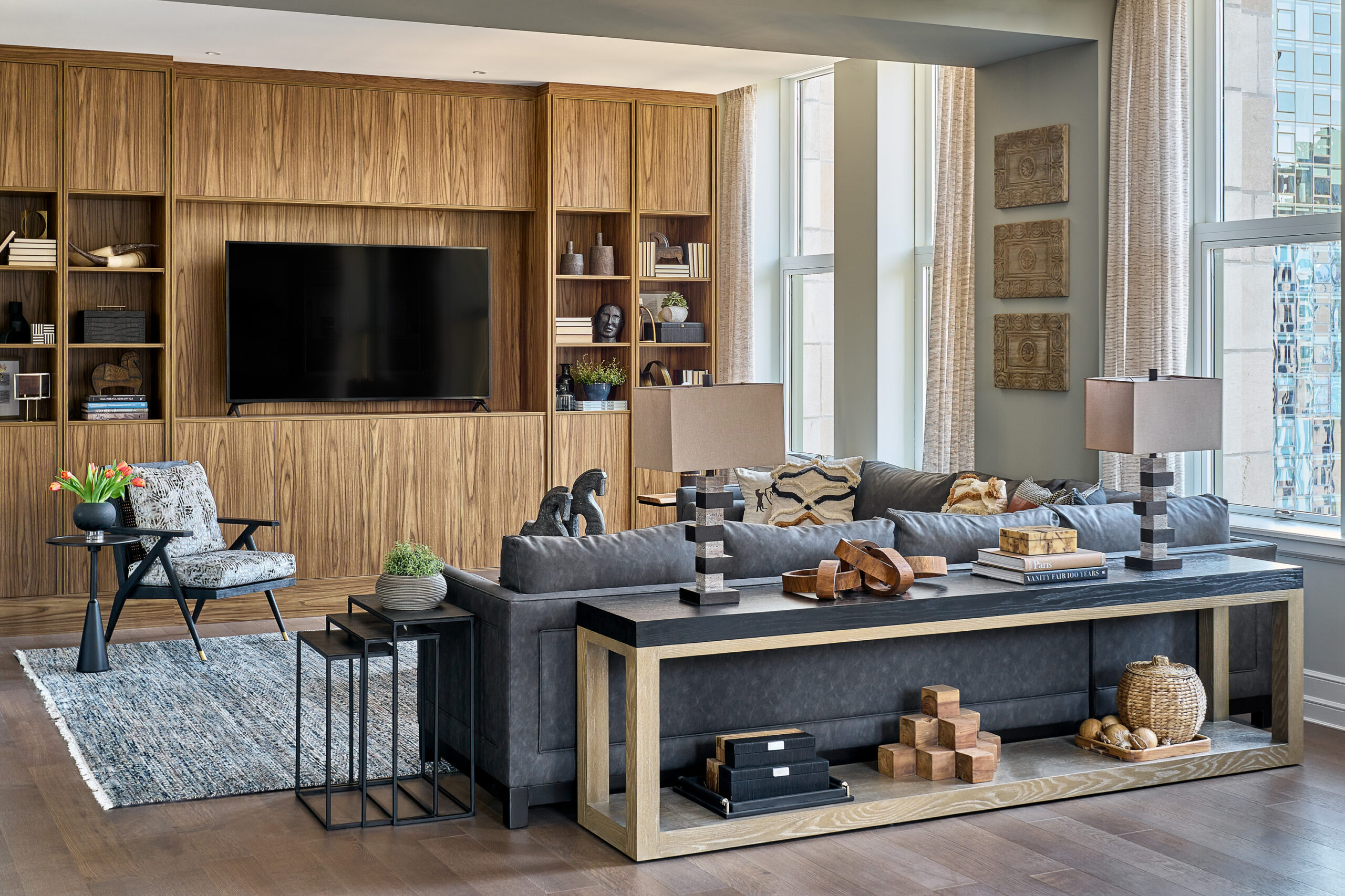
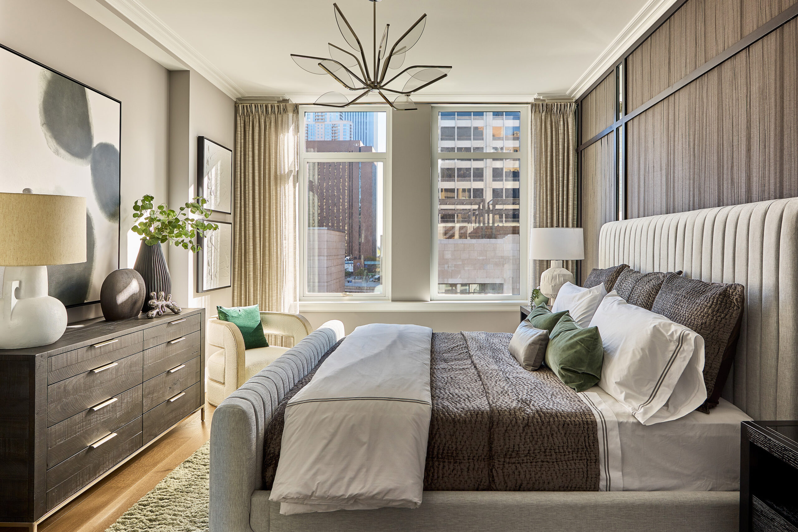
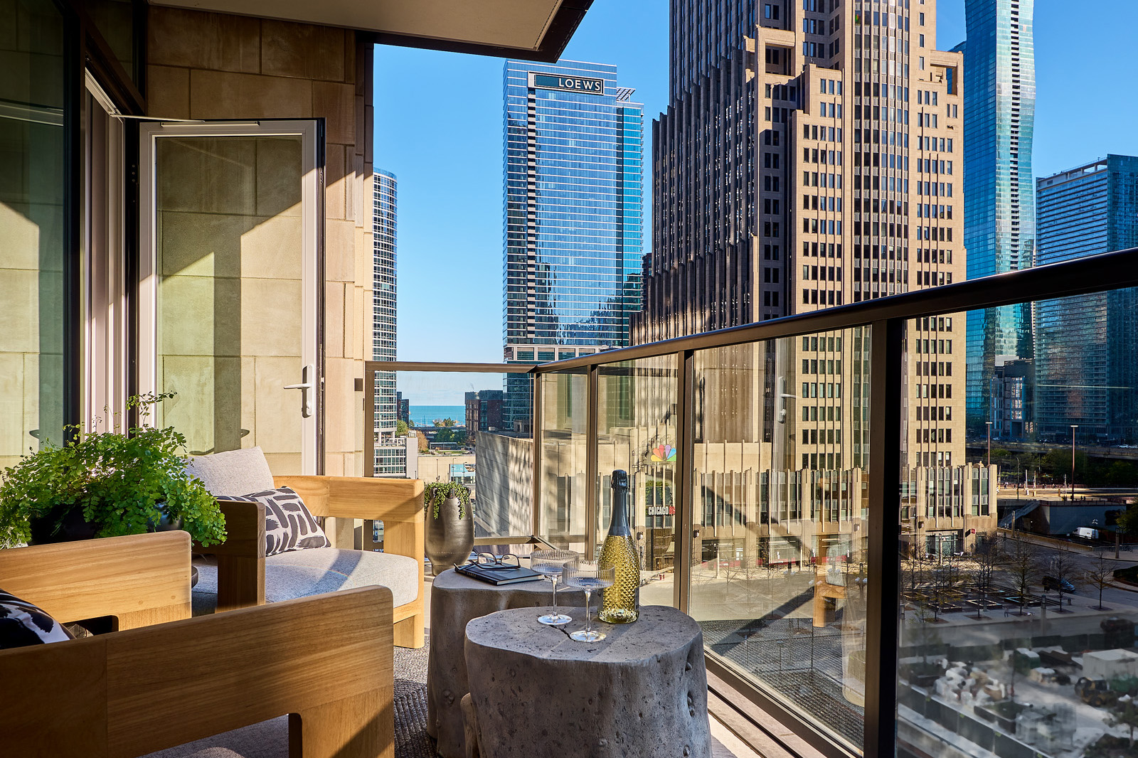
The 3,000+ square feet, three-bedroom unit with gallery was designed for an active empty nester couple in their mid to late 50’s. A transitional style blends traditional millwork detailing with clean line upholstery, polished metals, and contemporary art. Neutral textures are layered together with brass, leather, woven wallcoverings, and distinct, one-of-a-kind accessories. The third bedroom was designed and furnished as a library home office with a custom built-in desk, shelving, and storage area making the space highly functional. A mirror integrated as a backdrop maximizes breathtaking city views.
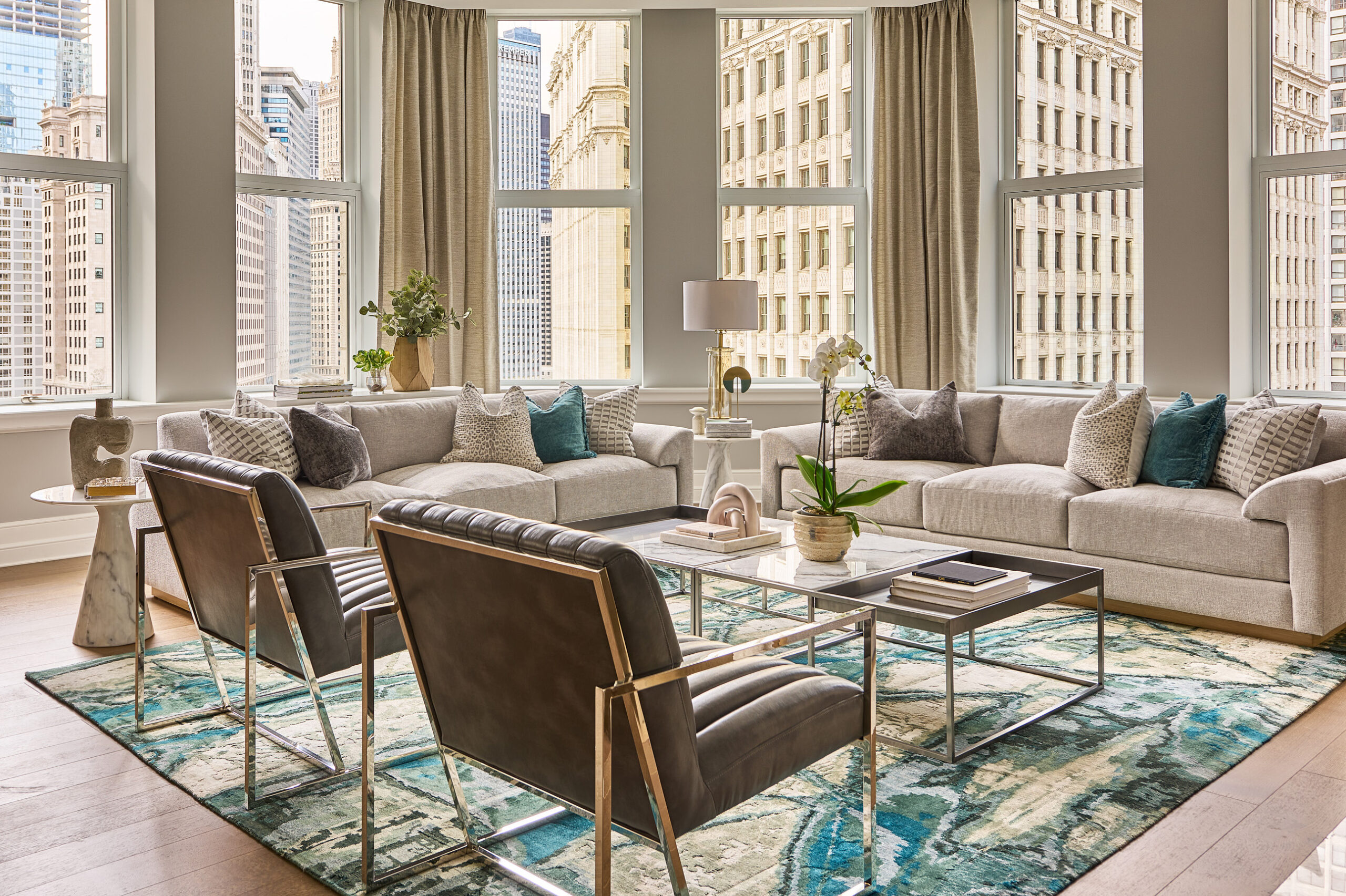
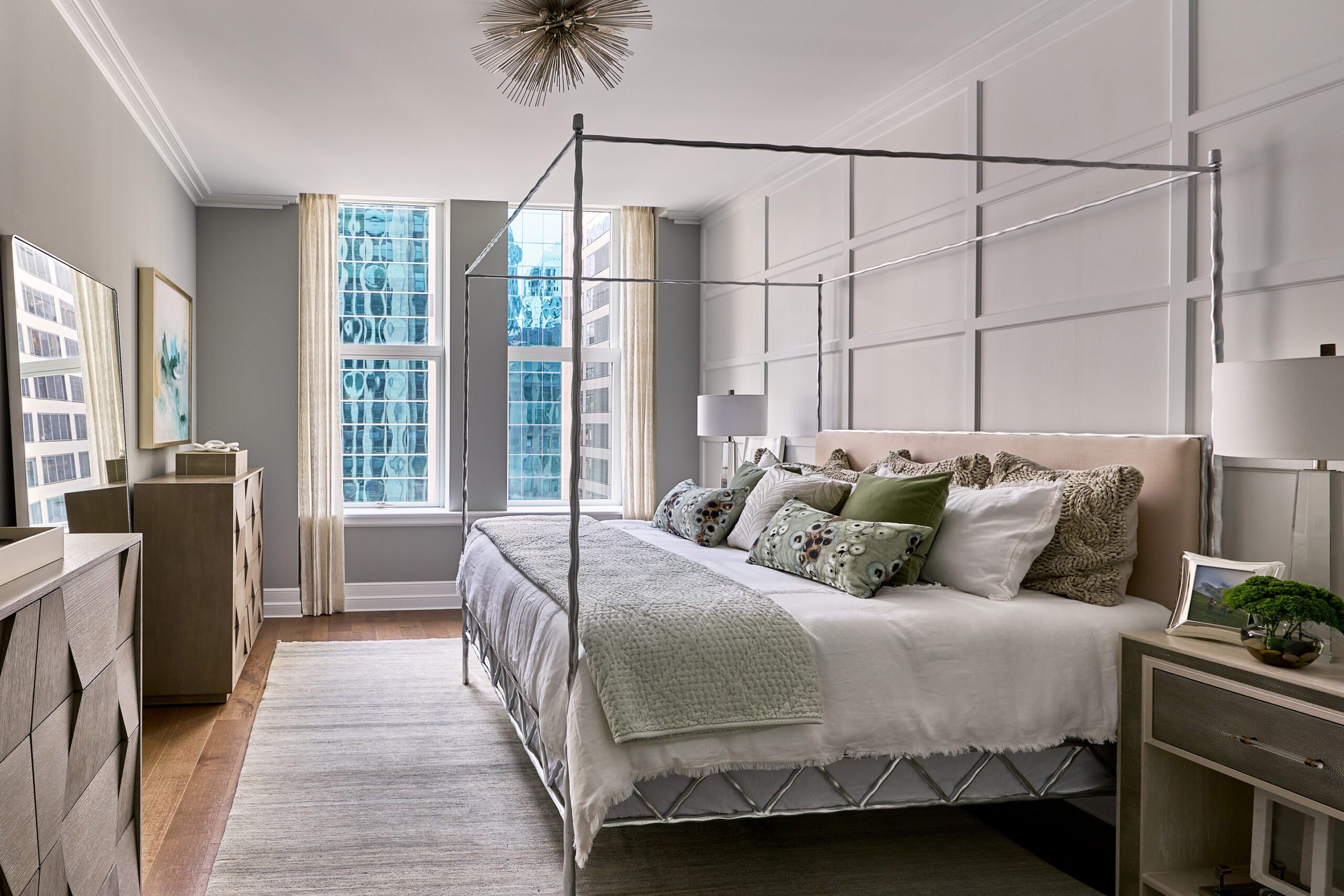
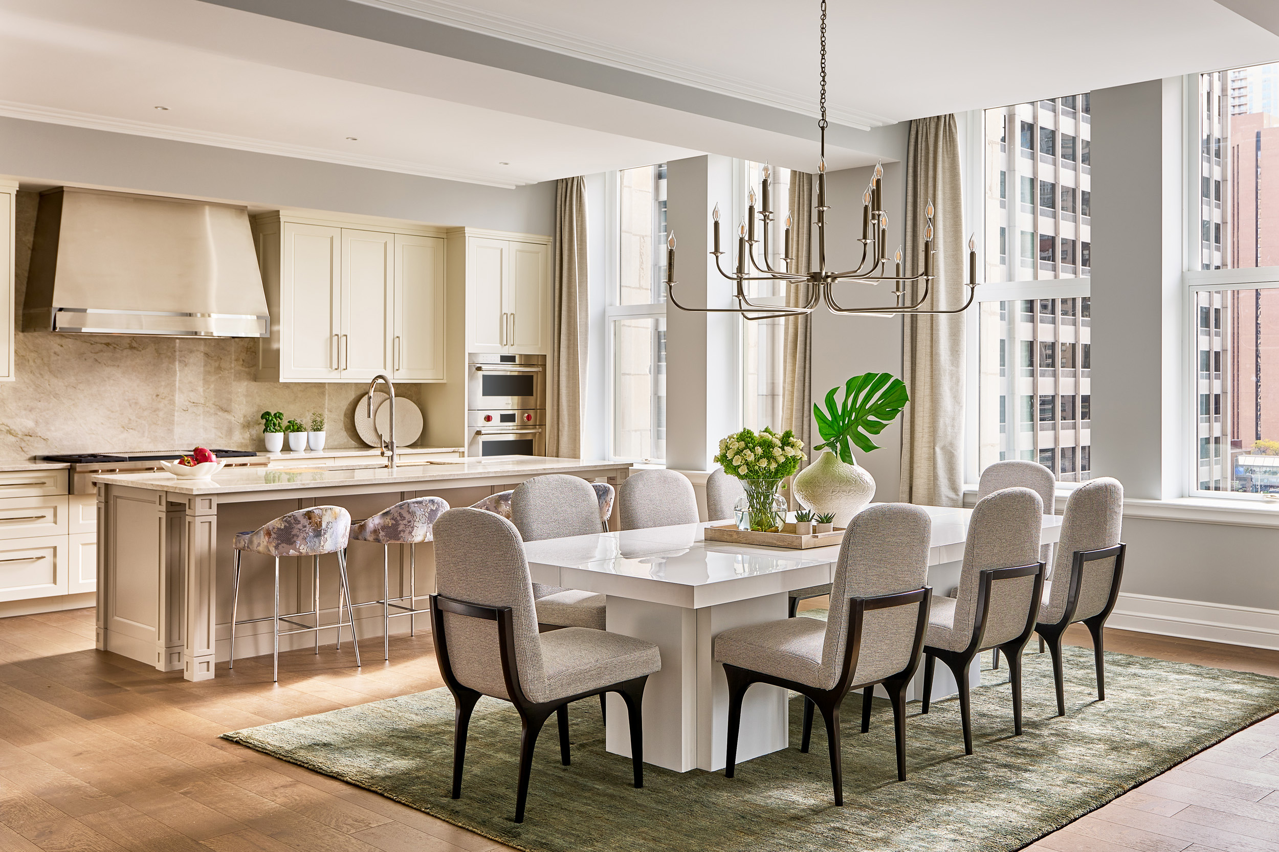
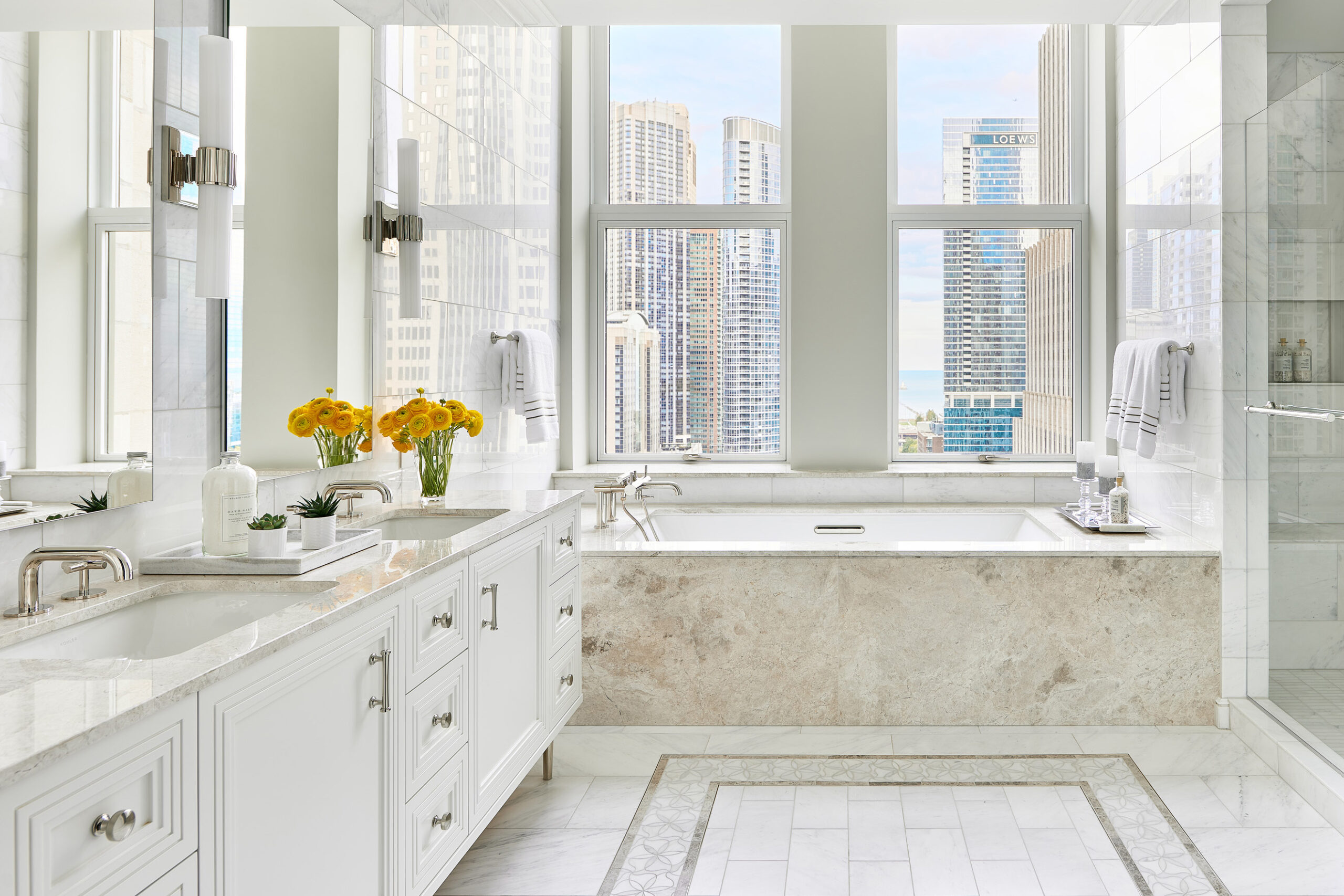
Also designed for a mid-50’s professional couple, another three-bed unit features a modern aesthetic with an urban edge. Layers of neutrals combine with accents of jewel toned greens and blues. Polished chrome, Carrera marble, white lacquer, and leather throughout the main living and dining areas enhance the vibe. The second and third bedrooms provide welcoming accommodations for guests or family members returning for a visit.
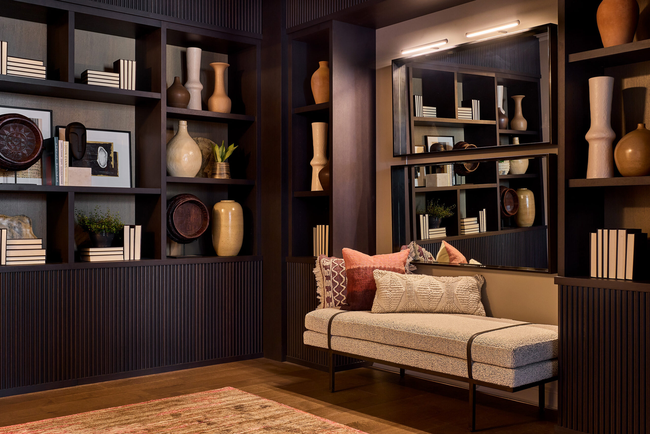
Another three-bedroom, three-bath unit was designed for a well-traveled, power executive couple in their mid to late 40’s. The unit’s gallery showcases a specially curated collection of art and artifacts from around the world with custom-built display walls providing a functional and impactful way to use the space. Rich wood tones, antique textiles, and modern art are combined with carefully selected collectibles to create an elevated composition that appeals to a sophisticated and worldly aesthetic.
PROJECT
Tribune Tower Residences
LOCATION
Chicago, IL
CLIENT
CIM Group and Golub & Company
TYPE
Five 1, 2 and 3-bedroom model units ranging from 1,760 – 3,250 square feet
TARGET AUDIENCE
Mid-senior level professionals and empty-nesters actively enjoying downtown Chicago’s sophisticated vitality
COMPLETED
2021
Category
Case Study, Model HomesThe R.O.E.® (Return on Environment)
MCA’s design approach scored immediate results with buyers who put several multi-million dollar units under contract shortly after opening. Jeanne Martini, Sales Director for Tribune Towers, reported the model units give potential buyers a solid sense of what the living spaces will be like. “People walk in and see what’s been done with this building everyone in Chicago loves, and they’re in awe,” she said.
